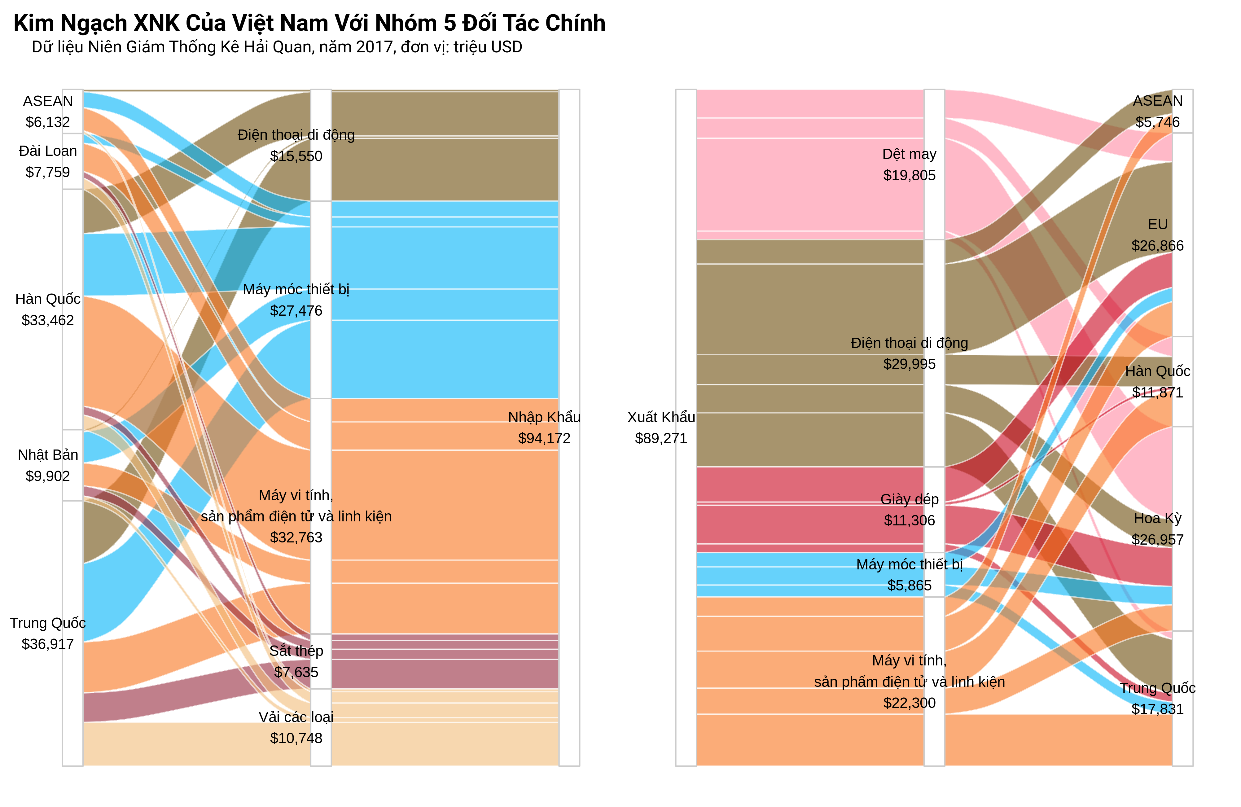
Recently, I was tasked to create an alluvial diagram to depict Vietnam’s trade data. This chart is a specific type of sankey diagram which visualize changes/flow within a system/network and it is particularly useful in highlighting dominant contributions to an overall flow.
I knew there are examples of sankey diagrams using plotly and networkD3 but their ouputs did not please me enough. And this is not a trivial task for ggplot2. Fortunately, Jason Cory Brunson, author of ggalluvial package, has done a great job building an abstraction layer over sankey diagram’s elements so that end users (me) can take advantage of ggplot2’s syntax.
×
![]()