Hanoi, my home city, is infamous for many things, say chronic traffic jams, insanely high property prices or poor food safety. And now, to make the list a bit longer, the city was reaping another status with an alarming level of air pollution.
Indeed, the phenomenon might have occurred for years. But recent open data, from both individuals and environment agencies, has provided accessible, empirical evidences for, and raised public concerns over the capital’s degrading air quality. Some records revealed that Hanoi’s outdoor pollution was on a par with the world’s most polluted cities in India and China. These figures should frighten its citizens as the WHO said that polluted air contributes to a quarter of 7 million deaths from heart disease, stroke and lung cancer each year.
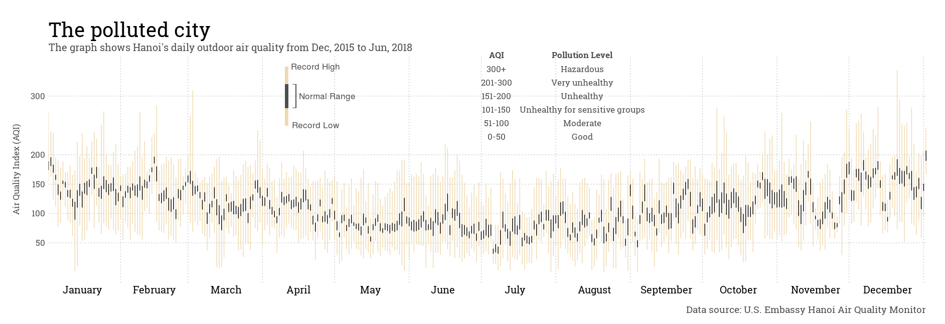
To better understand the condition, I made use of publicly available air quality data obtained from U.S. Embassy where they have a monitoring station located in downtown Hanoi. The chart below shows a picture of the city’s daily outdoor air pollution and how it changes for different months.

Notes
This visualization is by no means a truly original work of mine. It is inspired by the master piece in Edward Tufte’s The Visual Display of Quantitative Information (page 30), and is an adaption of Brad Boehmke’s Daytons’s Weather in 2014
I used data from the U.S. Embassy Hanoi Air Quality Monitor which is made readily available by AirNow
I used R to clean data and make the chart (see codes here)