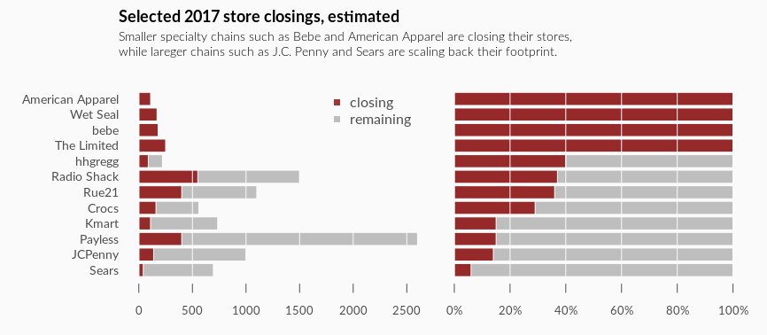
Bob Rudis recently introduced a “gem” from The Wall Street Journal which describes a retail trend of store closures for 2017 in America. The visualization uses pie charts to show the relative percentage of each store closing. I agree with Bob that it is hard to have a fair comparison between stores as there’s no sensible order of the stores and so much clutters poping out.
Here’s my redesign using bar charts. 
stores <- read.csv("~/stores.csv", stringsAsFactors = F)
stores <- within(stores, perct <- round(closing * 100 / total))
stores <- stores[order(stores$perct), ]
closed_col <- rgb(139, 0, 0, max = 255,  alpha = 200)

png("~/store_closing.png", 866, 378, res = 96)
par(mfrow = c(1, 2),
    mar = c(1, 1, 1, 1),
    oma = c(2, 7, 4, 1),
    bg = "gray98",
    family = "Lato",
    cex.axis = 0.8,
    col.axis = "gray30")
barplot(stores$total, names.arg = stores$store, border = F, horiz = T, las = 1,
        cex.names = 0.9, axes = F)
barplot(stores$closing, border = F, axes = F, col = closed_col, add = T, horiz = T)
grid(NULL, NA, col = "gray98", lty = 1)
axis(1, col = "gray98", col.ticks = "gray30")
legend("topright", legend = c("closing", "remaining"), col = c(closed_col, "gray"),
       pch = 15, bty = "n", text.col = "gray30")
barplot(rep(100, 12), border = F, horiz = T, axes = F)
barplot(stores$perct, border = F, axes = F, col = closed_col, add = T, horiz = T)
grid(NULL, NA, col = "gray98", lty = 1)
axis(1, col = "gray98", col.ticks = "gray30",
     at = seq(0, 100, 20), labels = paste0(seq(0, 100, 20), "%"))
mtext("Selected 2017 store closings, estimated", outer = T, line = 2.5, adj = 0,
      font = 2, cex = 1.1)
mtext("Smaller specialty chains such as Bebe and American Apparel are closing their stores,\nwhile lareger chains such as J.C. Penny and Sears are scaling back their footprint.",
      outer = T, line = 0.5, adj = 0, family = "Lato Light", cex = 0.9)
dev.off()